本文将介绍盒子水平居中和垂直居中的几种方式!
水平居中的方法:
①给需要水平居中的元素加margin:0 auto;使得左右外边距自适应
效果图:
代码:
CSS代码,用选择器给需要水平居中的元素加(常用于盒子居中,盒子显示类型为block)
width: 200px;
        height: 200px;
        /* 用左右外边距自适应来实现水平居中 */
        margin: 0 auto;
        background-color: orange;
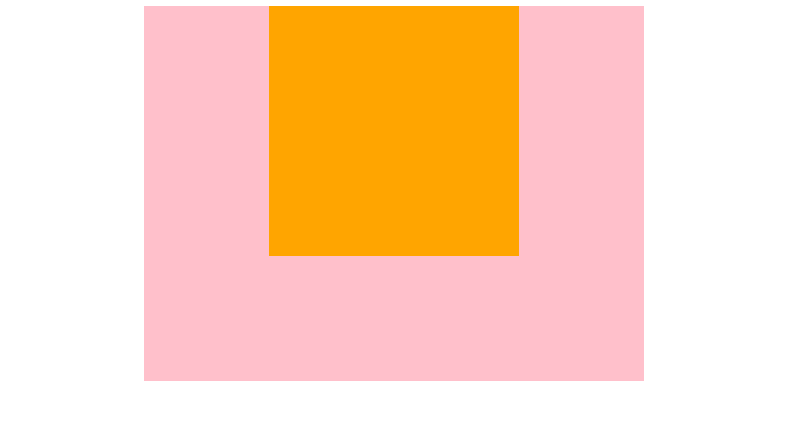
②用display将需要居中的盒子转换成行内块级,然后给父元素加text-algin:center;
.box1 {
        height: 300px;
        width: 400px;
        background-color: pink;
        /* 给父元素设置text-align:center;使得子元素居中 */
        text-align: center;
      }
      .box2 {
        /* 将父元素转换成行内块级 */
        display: inline-block;
        width: 200px;
        height: 200px;
        background-color: orange;
      }
垂直和水平居中:
将讲解垂直和水平都居中,大家可以灵活使用,例如只需要水平的,或者只需要垂直居中的,则可以按需调整。
①手动计算(最不可取的方式,不推荐)
.box1 {
        height: 400px;
        width: 400px;
        background-color: pink;
      }
      .box2 {
        /* 手动计算,用父元素减去子元素的高宽,然后除二,得出距离上面和左边的距离,设置margin即可(此方法不可取) */
        margin-top: 100px;
        margin-left: 100px;
        width: 200px;
        height: 200px;
        background-color: orange;
      }
②用定位
.box1 {
        position: relative;
        height: 400px;
        width: 400px;
        background-color: pink;
      }
      .box2 {
        position: absolute;
        top: 50%;
        left: 50%;
        margin-left: -100px;
        margin-top: -100px;
        width: 200px;
        height: 200px;
        background-color: orange;
      }
利用子绝父相。给父元素加position:relative;绝对定位,然后给子元素设置绝对定位,left和top设置50%,手动计算一下子元素高度和宽度,然后除二,分别用margin去设置负数即可(不是很推荐,下面的方法最推荐)
③定位+变形偏移效果
<!DOCTYPE html>
<html lang="en">
  <head>
    <meta charset="UTF-8" />
    <meta http-equiv="X-UA-Compatible" content="IE=edge" />
    <meta name="viewport" content="width=device-width, initial-scale=1.0" />
    <title>宗波尘客-垂直和水平居中演示代码</title>
    <style>
      .box1 {
        position: relative;
        height: 400px;
        width: 400px;
        background-color: pink;
      }
      .box2 {
        position: absolute;
        top: 50%;
        left: 50%;
        transform: translate(-50%, -50%);
        width: 200px;
        height: 200px;
        background-color: orange;
      }
    </style>
  </head>
  <body>
    <div class="box1">
      <div class="box2"></div>
    </div>
  </body>
</html>
和上方的类似,但是子元素的宽度计算由transform:translate(-50%,-50%)实现自动计算,无需手动计算
关于盒子垂直水平居中注意事项:
①上方的代码中,类名为box1的是父元素,box2的是父元素里面的子元素
②由于元素涉及到脱离标准流的情况,所以每个不同的代码使用情况场景不一样,大家如果一种方式不适用有冲突,可以试另一种方式